Color grading: tint shadows, midtones and highlights
Grade a RAW photo in Raw Photo Editor: a color wheel and Luminance for shadows, midtones, highlights and the whole image, with Blending and Balance.
Color grading adds a color to the dark, middle and bright tones of a photo, separately. Warm highlights with cool shadows is the classic: it separates light from shade and gives a photo a graded, filmic look without changing its overall white balance. Each range also has a Luminance slider to make it lighter or darker, and Blending and Balance decide where one range ends and the next begins. It works like Color Grading in Lightroom.
Open it with the Grade tab or Shift 5.
The controls
Fujifilm FinePix S9600 · RAF CC0, raw.pixls.us Shadows Hue 210 · Sat 30 · Midtones Hue 25 · Sat 8 · Lum +10 · Highlights Hue 40 · Sat 35
The buttons at the top pick the range you are grading. The dot on each button shows its current color, so you can see the whole grade at a glance.
| Range | What it tints |
|---|---|
| Shadows | The dark tones. |
| Midtones | The tones around the middle, where shadows meet highlights. |
| Highlights | The bright tones. |
| Global | Every tone in the photo alike. |
Under the buttons is the color wheel for the selected range. The angle around the wheel is the hue: red at the top, then yellow, green, cyan, blue and magenta going round clockwise. The distance from the centre is the saturation: the centre adds nothing, the rim adds the most.
| Control | Range | What it does |
|---|---|---|
| Hue | 0 to 360 | The color, as a position on the wheel. The slider’s track shows the colors. |
| Saturation | 0 to 100 | How strong the color is. 0 adds nothing. |
| Luminance | −100 to +100 | Makes the range lighter or darker. +100 is about one stop brighter where the range applies fully. |
| Blending | 0 to 100 | How much the ranges overlap. Default 50. |
| Balance | −100 to +100 | Moves the boundary between shadows and highlights. |
The color changes hue and saturation only, not brightness: a graded photo is exactly as light as before, unless you move a Luminance slider. A range whose Saturation and Luminance are 0 is left alone. Reset in the header appears once anything has moved and clears all four ranges, Blending and Balance.
Using the wheel
- Pick a color: click the wheel, or drag the handle. The farther from the centre, the stronger the color.
- Change the strength only: hold Shift while you drag. The hue stays put and the handle moves along its line from the centre.
- Fine adjustments: hold Ctrl (⌘ on a Mac) while you drag. The handle moves a quarter as far as the pointer and doesn’t jump to where you clicked.
- Remove the color: double-click the wheel. The saturation goes back to 0.
- With the keyboard: click or tab to the wheel, then ← → change the hue and ↑ ↓ the saturation, by 1, or by 10 with Shift.
For exact values, use the Hue and Saturation sliders under the wheel, or type a number into their boxes. Each drag or slider move is one step in the history, so Ctrl Z undoes it.
A good habit is to drag far out while you look for the hue, then bring Saturation back down.
Blending and Balance
The editor sorts the photo into ranges by brightness as you see it on screen. At Balance 0, shadows give way to highlights at middle brightness, and the midtones are strongest there.
Blending sets how gradual that change is. At 50 the change is spread over a wide band of tones, so there is no visible line between the colors. Lower values keep the shadow and highlight colors apart, with a narrower band of midtones; higher values let them flow into each other and widen the midtones.
Balance to the right lowers the boundary and gives more of the photo to the highlight color; at +100 almost everything takes it. Balance to the left raises the boundary and gives more to the shadow color. This is the same direction as Lightroom’s Balance slider.
Typical palettes
- Teal and orange. Highlights Hue 30 to 45, Shadows Hue 180 to 210. The orange flatters skin and sunlit areas, the teal cools the shade. Popular in film and travel photos; easy to overdo.
- Warm light. Highlights Hue 35 to 50 with a low Saturation, Shadows Hue around 220, and a touch of the same warm hue in the Midtones. Adds the glow of late sun to a flat midday scene.
- Cold and moody. Shadows Hue 200 to 230, Highlights Hue near 50 at a very low Saturation so whites don’t go blue too, and the Shadows Luminance down a little.
- Faded film. Shadows Luminance up 20 to 40 for lifted blacks, a cool shadow tint and a warm Global tint at Saturation 5 to 10.
- Toned black and white. Make the photo black and white with the HSL Saturation sliders, then add a warm sepia in the highlights (Hue 30 to 40) and a cool tone in the shadows to imitate toned prints. Saturation −100 on the Detail tab won’t work for this: it is applied after color grading and removes the tint again.
The built-in Film Warm, Cinematic Teal and Soft Pastel presets all use color grading; apply one and open this tab to see their values. Opposite colors on the wheel give the strongest separation. Colors close together, such as yellow highlights and orange shadows, give a gentler, unified tint.
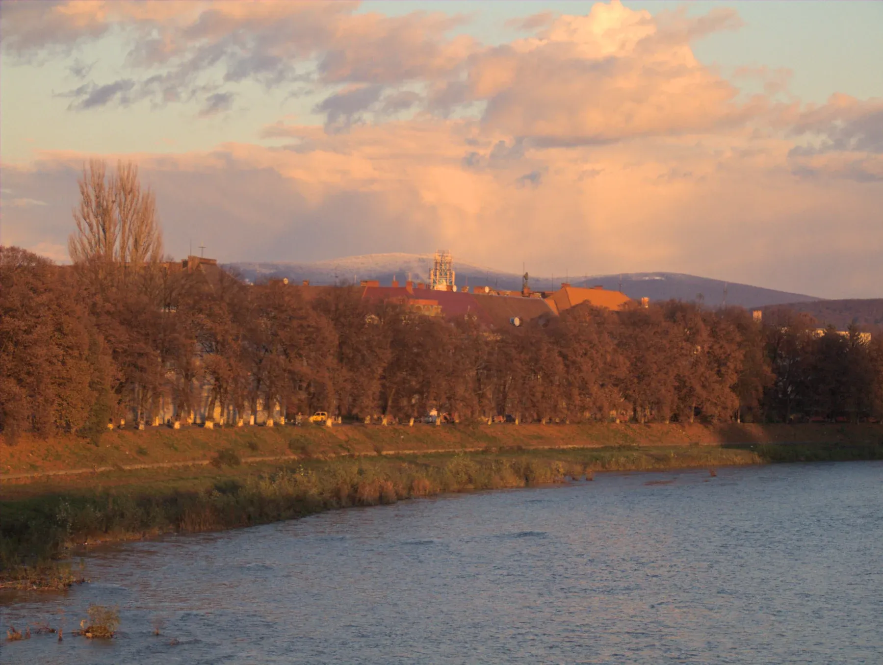
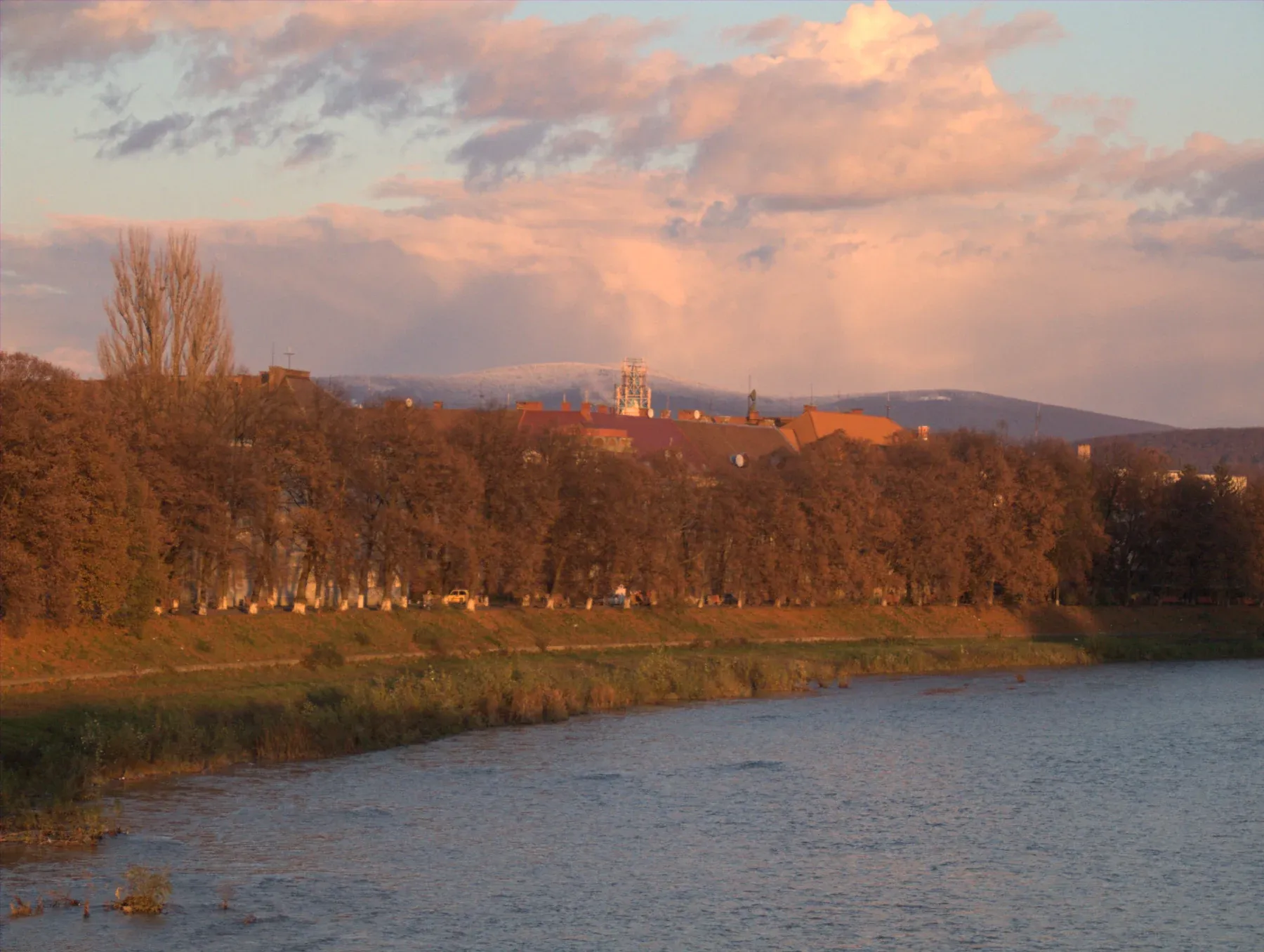
Fujifilm FinePix S9600 · RAF CC0, raw.pixls.us Shadows Hue 210 · Sat 30 · Midtones Hue 25 · Sat 8 · Lum +10 · Highlights Hue 40 · Sat 35
Keep it subtle
Grading works best when the viewer doesn’t notice it. Saturation between 10 and 30 is usually enough. Look at neutral areas, such as white walls, clouds and grey stone: if they turn visibly colored, back off. Toggle the whole effect by pressing \ for a before/after split, or hold B; see viewing and comparing.
Set white balance first. Grading is a creative tint on top of a correct balance, not a way to fix a color cast.
Coming from split toning
Earlier versions of the editor had Split Toning, with a highlight and a shadow color. Color grading replaces it: edits, settings files and presets that used split toning load with those colors as the Highlights and Shadows of color grading, at Blending 50, and look exactly as before.
Where to go next
- Tone curve: color grading with the R, G and B curves.
- HSL / Color: change single colors, or turn the photo black and white.
- Presets: save a look you like and apply it to other photos.