Tone curve: shape contrast and color point by point
Use the tone curve in Raw Photo Editor: add, move and remove points, build an S-curve or a matte fade, and grade color with the separate red, green and blue curves.
The tone curve maps every input brightness to an output brightness. Where the curve is steeper than the diagonal, contrast goes up; where it is flatter, contrast goes down. That lets you put contrast exactly where you want it, which the single Contrast slider in the Basic panel can’t do.
Open it with the Curve tab or Shift 3.
Canon EOS 750D · CR2 CC0, raw.pixls.us Exposure +0.55 · Contrast +25 · Highlights −55 · Shadows +40 · Whites +20 · Blacks −20 · RGB curve (0.25 → 0.20), (0.75 → 0.80)
Reading the curve
The horizontal axis is the input tone, from black on the left to white on the right; the vertical axis is the output. Both use the brightness scale you see on screen, so the middle of the grid is a midtone, not 50% of the light. The faint diagonal is the unchanged curve, and the grid divides the range into quarters.
Behind the curve is a histogram of the tones that curve works on: for RGB the brightness of the photo, for R, G and B that color channel. It shows where the photo’s tones sit, so you know which part of the curve will change something. A dark underwater shot, for example, has most of its tones in the left third, and a point in the right half moves little more than the sun and the surface. The histogram is of the photo with every other edit but without the curves, so it stays put while you drag.
Point at the graph and the top-left corner reads out the input and output values under the pointer, from 0 to 255; while you drag a point it shows that point’s values.
A new image starts with two points, black at the bottom left and white at the top right, joined by a straight line. The curve passes smoothly through every point you add and never overshoots between them, so it can’t create sudden reversals of tone.
Edit points
Canon EOS 750D · CR2 CC0, raw.pixls.us
- Add a point: click anywhere in the graph. The point goes on the curve straight above or below where you clicked, so a click alone never changes the photo; drag to shape the curve. A click close to an existing point picks that point up instead of adding another beside it.
- Move a point: drag it. A point can’t pass its neighbours, so the curve always runs left to right.
- Move the end points: drag the black point up to fade the blacks, or to the right to clip the darkest tones to black. The white point does the same from the other end: down to dim the whites, left to clip to white.
- Remove a point: drag it out of the graph and let go (the readout says Release to remove), or double-click or right-click it. The two end points can’t be removed.
Each drag is one step in the history, so Ctrl Z undoes it. The Reset button in the header appears once any curve has changed and puts all four curves back to a straight line.
RGB and the R, G, B channels
The buttons above the graph pick which curve you edit.
| Channel | What it changes |
|---|---|
| RGB | Brightness only. All three color channels are scaled together, so hue and saturation stay as they are. |
| R | The red channel. Up adds red, down adds cyan. |
| G | The green channel. Up adds green, down adds magenta. |
| B | The blue channel. Up adds blue, down adds yellow. |
The RGB curve is applied first, then the three color curves. If you know Lightroom, note one difference: here the RGB curve doesn’t raise saturation when it raises contrast, because it acts on brightness alone. If you want richer colors with a steep curve, add Vibrance on the Detail tab.
Common shapes
S-curve
Pull a point at the lower quarter down a little and push a point at the upper quarter up a little, as in the figure. Shadows get darker, highlights brighter, and the midtones steeper. Small moves go a long way: the example moves each point by only 0.05.
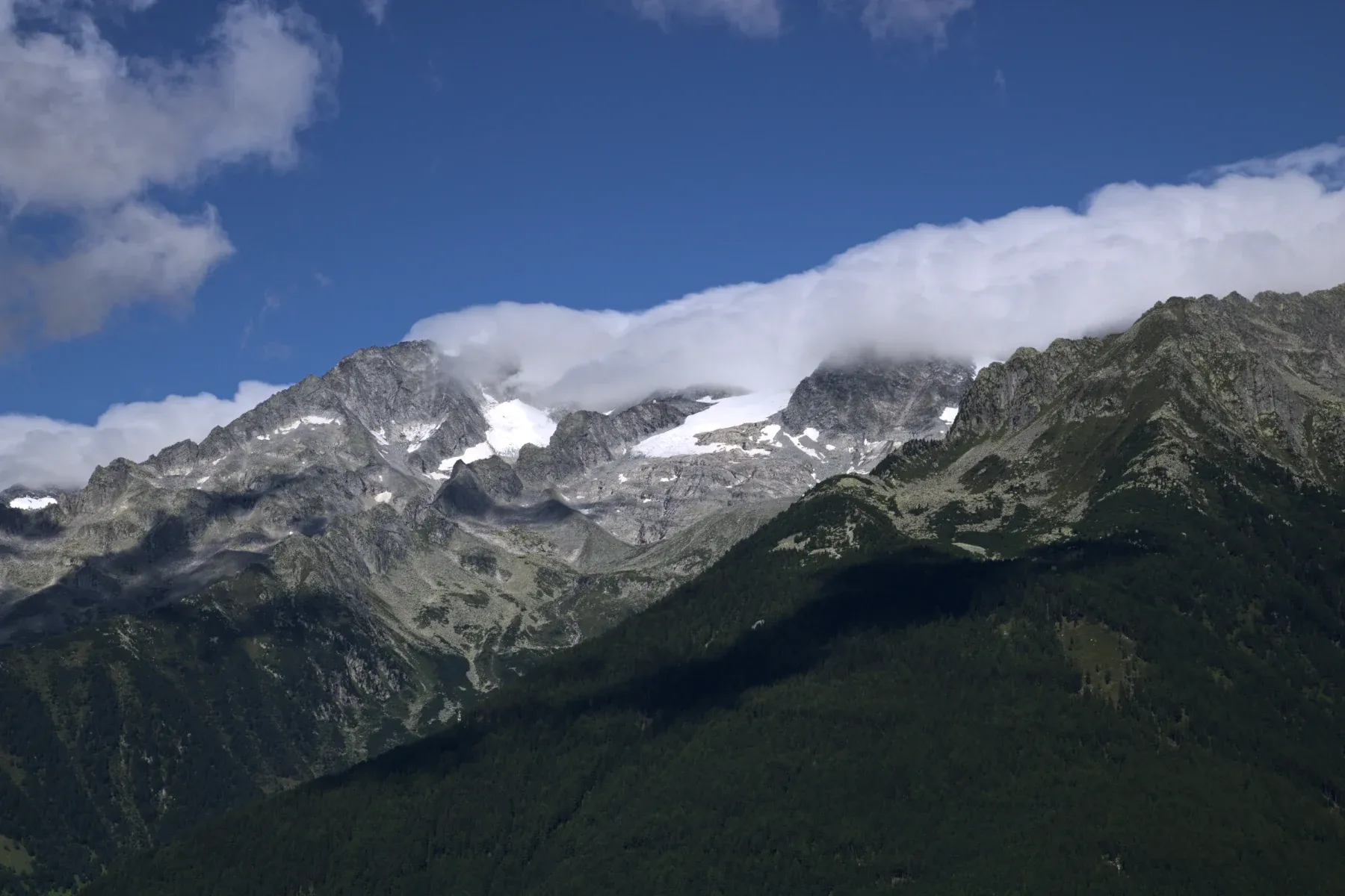
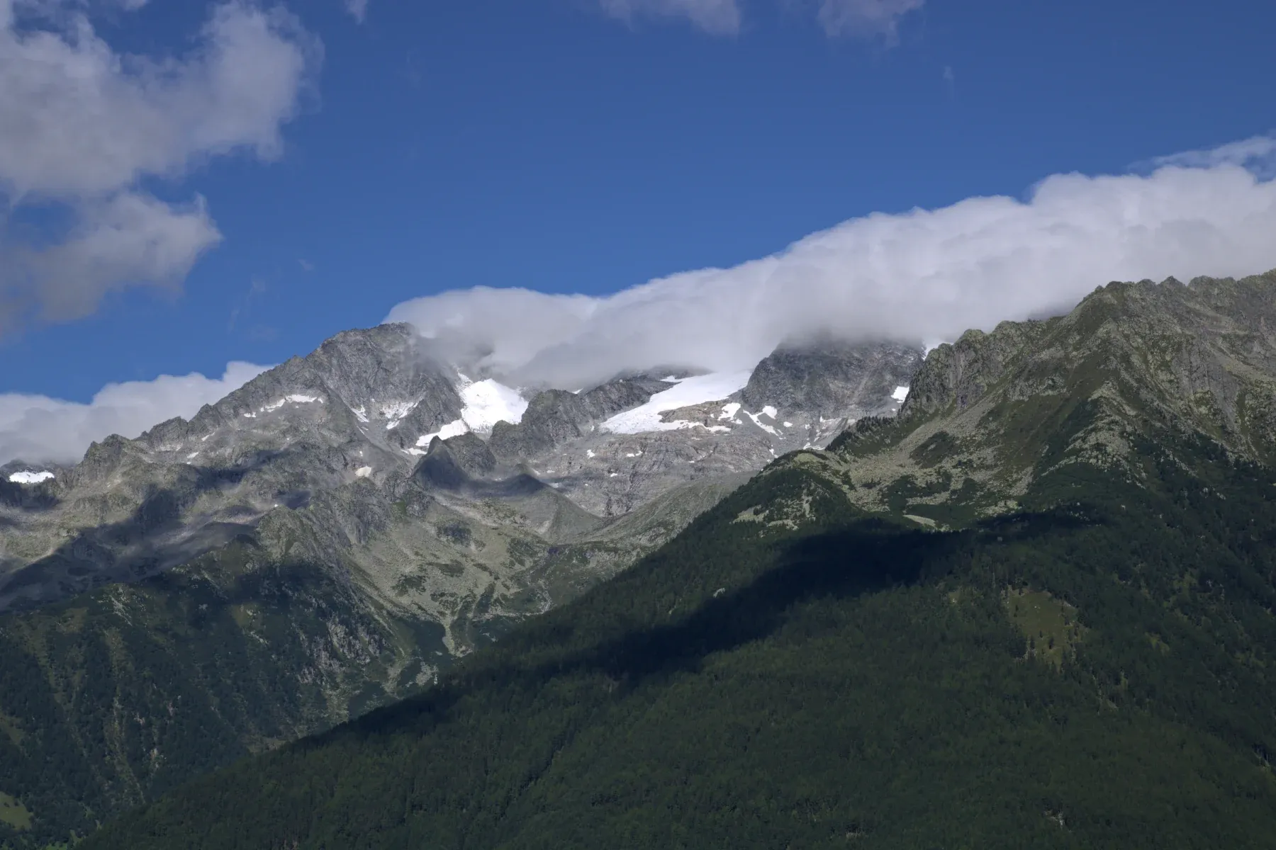
Canon EOS 750D · CR2 CC0, raw.pixls.us RGB curve: 0.25 → 0.20 · 0.75 → 0.80
Unlike the Contrast slider, which always pivots on middle grey, you choose where the steep part sits. Move both points to the right to put the contrast in the bright tones, such as clouds; move them left for a dark scene.
Matte fade
Drag the black end point straight up. The darkest tone in the photo is now a dark grey instead of black, which gives the faded look of matte prints and some film stocks. Add a point near the lower quarter to keep the midtones where they were. Dragging the white end point down does the same for the highlights.
A raised black point means nothing in the photo is pure black any more, so the blue shadow clipping indicator (J) shows little or nothing. That is expected.
Color grading with R, G, B
The color curves are a precise way to tint shadows and highlights separately. On the B curve, lift a point in the shadows and lower one in the highlights: shadows go blue and highlights go yellow. On the R curve, a small lift in the highlights warms skin and sunlit areas. Keep the moves small, a few hundredths, and watch neutral areas such as white walls. For a simpler way to tint tones, see color grading.
Curve or Contrast?
Use Contrast in the Basic panel for an overall lift; it is one slider and easy to undo. Use the curve when you want contrast in one tonal range only, a faded black, or color shifts. The two add up: Contrast is applied first, and the curve shapes its result.
Tones brighter than white, for example after a strong Exposure push, are carried through the curve rather than cut off at the top of the graph.
Where to go next
- Basic panel: Exposure, Contrast and the tonal sliders the curve builds on.
- HSL / Color: change single colors instead of whole channels.
- Masks: change contrast in one area.